使用 Markdown 编写极简 PPT
Update in 21.12.17:
请使用 slides.com 替代 reveal.js 或者是 nodeppt,因为我在重新组织一个简介的 PPT 的过程中,又体会到了可视化编辑意味着一切这个道理,使用 markdown 去编写 PPT 有点太过于 Geek 了,有趣但无效率可言。
我想应该有人讲过:
Markdown can record everything.
PPT 对于我来讲是一个复杂的工作,因为想要更好的呈现内容,就需要搞懂复杂的 Power Point / Keynote 的界面功能,还需要在画布中对布局、素材进行精心的编排,更不用说需要进行转场动画等的动效设置,真的太头疼了,而 Reveal.js 解决了我的烦恼,通过简单的 Markdown 语法,即可呈现出简单、大气的 PPT。
当然,若对 PPT 的编排有更改的要求,还是不要使用 Reveal.js,只推荐使用它来做一些极简展性的主题,比如乔老爷的发布会(就是不提老罗):

初始化
git clone https://github.com/hakimel/reveal.js.git
cd reveal.js && npm install
npm start
然后,打开浏览器,访问:http://localhost:8000 即可看到浏览效果。
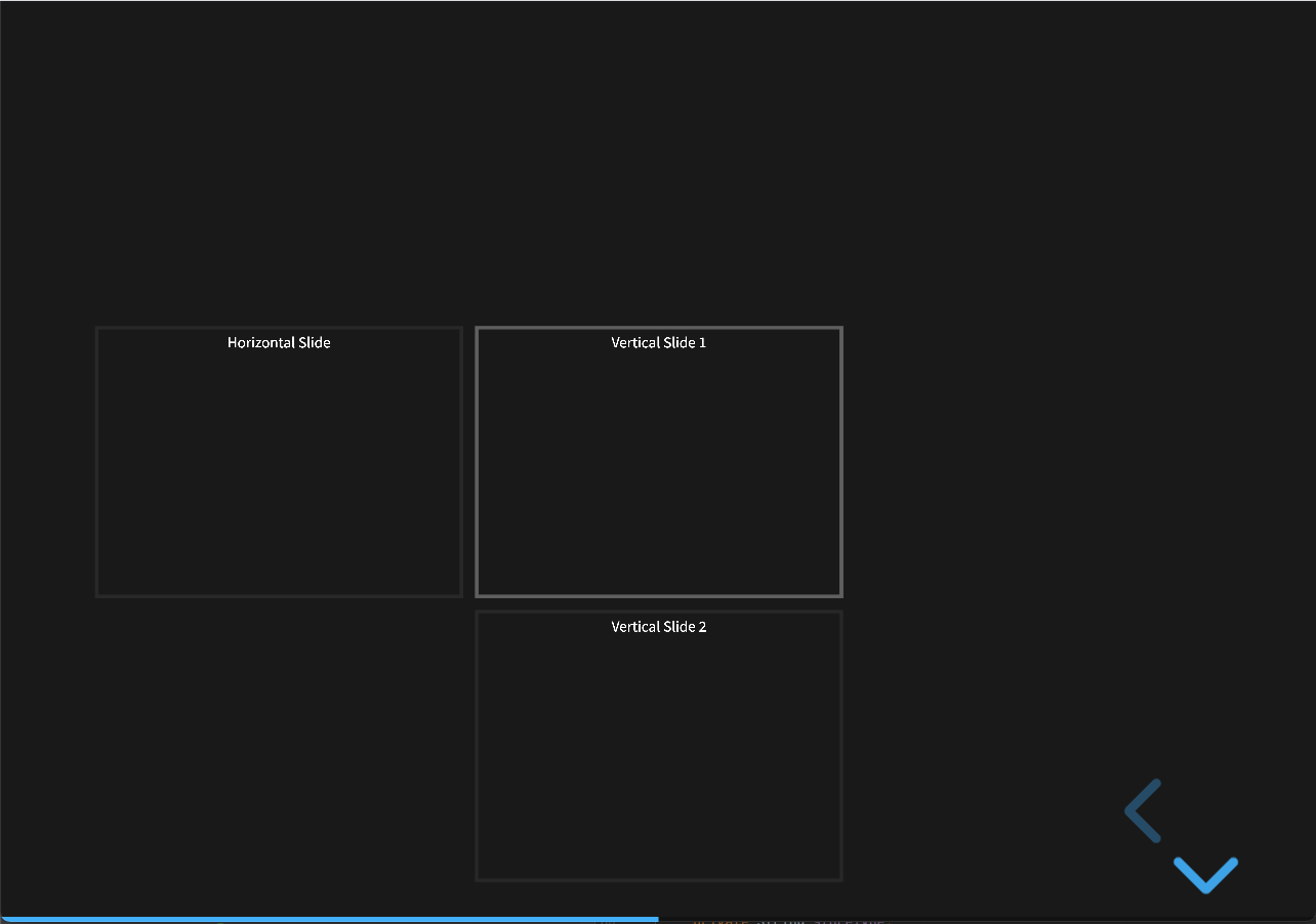
滑动方向
Reveal.js 基本标签结构为:.reveal > .slides > section,对于 section 元素处在第三级则默认为一页 PPT(默认滑动的方向为水平方向),若 section 中还嵌套 section,则单标子页(滑动方向为纵向),以下为示例:
<div class="slides">
        <section>Horizontal Slide</section>
        <section>
        <section>Vertical Slide 1</section>
        <section>Vertical Slide 2</section>
        </section>
</div>
引入 Markdown
Reveal.js �设计之初是使用标签语法进行渲染 PPT 的,而 Markdown 是作为一种插件的形式,因此若想使用 Markdown 编写 PPT,首先需要引入相关插件(模板工程已支持):
<script src="plugin/markdown/markdown.js"></script>
<script>
  Reveal.initialize({
    plugins: [ RevealMarkdown ]
  });
</script>
其次,在 index.html 中编写 Markdown 时,所有 markdown 都遵从以下规则添加 attributes:
<section data-markdown>
  <textarea data-template>
    ## Slide 1
    A paragraph with some text and a [link](http://hakim.se).
    ---
    ## Slide 2
    ---
    ## Slide 3
  </textarea>
</section>
当然,我更喜欢通过外部文件进行编写,这样就完全可以脱��离 HTML 文件了:
<section data-markdown="example.md"
         data-separator="---"
         data-separator-vertical="--"
         data-separator-notes="^Note:"
         data-charset="utf8">
    <!--
        Note that Windows uses `\r\n` instead of `\n` as its linefeed character.
        For a regex that supports all operating systems, use `\r?\n` instead of `\n`.
    -->
</section>
定制主题
Reveal.js 预编译了一些主题颜色:
| Name | Effect |
|---|---|
| black | Black background, white text, blue links (default) |
| white | White background, black text, blue links |
| league | Gray background, white text, blue links |
| beige | Beige background, dark text, brown links |
| sky | Blue background, thin dark text, blue links |
| night | Black background, thick white text, orange links |
| serif | Cappuccino background, gray text, brown links |
| simple | White background, black text, blue links |
| solarized | Cream-colored background, dark green text, blue links |
| blood | Dark background, thick white text, red links |
| moon | Dark blue background, thick grey text, blue links |
主题会自动暴露一份 CSS 自定义属性,以下为属性列表:
:root {
  --r-background-color: #{$backgroundColor};
  --r-main-font: #{$mainFont};
  --r-main-font-size: #{$mainFontSize};
  --r-main-color: #{$mainColor};
  --r-block-margin: #{$blockMargin};
  --r-heading-margin: #{$headingMargin};
  --r-heading-font: #{$headingFont};
  --r-heading-color: #{$headingColor};
  --r-heading-line-height: #{$headingLineHeight};
  --r-heading-letter-spacing: #{$headingLetterSpacing};
  --r-heading-text-transform: #{$headingTextTransform};
  --r-heading-text-shadow: #{$headingTextShadow};
  --r-heading-font-weight: #{$headingFontWeight};
  --r-heading1-text-shadow: #{$heading1TextShadow};
  --r-heading1-size: #{$heading1Size};
  --r-heading2-size: #{$heading2Size};
  --r-heading3-size: #{$heading3Size};
  --r-heading4-size: #{$heading4Size};
  --r-code-font: #{$codeFont};
  --r-link-color: #{$linkColor};
  --r-link-color-dark: #{darken($linkColor , 15% )};
  --r-link-color-hover: #{$linkColorHover};
  --r-selection-background-color: #{$selectionBackgroundColor};
  --r-selection-color: #{$selectionColor};
}
在需要使用的地方,只需要这么做:background: css(----r-heading-color)。
当然,创建自己的主题也非常简单,在 /css/theme/source 对照着主题文件创建一份,再执行 npm run build -- css-themes 就行了。
配置参考
Reveal.initialize({

  // Display presentation control arrows
  controls: true,

  // Help the user learn the controls by providing hints, for example by
  // bouncing the down arrow when they first encounter a vertical slide
  controlsTutorial: true,

  // Determines where controls appear, "edges" or "bottom-right"
  controlsLayout: 'bottom-right',

  // Visibility rule for backwards navigation arrows; "faded", "hidden"
  // or "visible"
  controlsBackArrows: 'faded',

  // Display a presentation progress bar
  progress: true,

  // Display the page number of the current slide
  // - true:    Show slide number
  // - false:   Hide slide number
  //
  // Can optionally be set as a string that specifies the number formatting:
  // - "h.v":   Horizontal . vertical slide number (default)
  // - "h/v":   Horizontal / vertical slide number
  // - "c":   Flattened slide number
  // - "c/t":   Flattened slide number / total slides
  //
  // Alternatively, you can provide a function that returns the slide
  // number for the current slide. The function should take in a slide
  // object and return an array with one string [slideNumber] or
  // three strings [n1,delimiter,n2]. See #formatSlideNumber().
  slideNumber: false,

  // Can be used to limit the contexts in which the slide number appears
  // - "all":      Always show the slide number
  // - "print":    Only when printing to PDF
  // - "speaker":  Only in the speaker view
  showSlideNumber: 'all',

  // Use 1 based indexing for # links to match slide number (default is zero
  // based)
  hashOneBasedIndex: false,

  // Add the current slide number to the URL hash so that reloading the
  // page/copying the URL will return you to the same slide
  hash: false,

  // Flags if we should monitor the hash and change slides accordingly
  respondToHashChanges: true,

  // Push each slide change to the browser history.  Implies `hash: true`
  history: false,

  // Enable keyboard shortcuts for navigation
  keyboard: true,

  // Optional function that blocks keyboard events when retuning false
  //
  // If you set this to 'focused', we will only capture keyboard events
  // for embedded decks when they are in focus
  keyboardCondition: null,

  // Disables the default reveal.js slide layout (scaling and centering)
  // so that you can use custom CSS layout
  disableLayout: false,

  // Enable the slide overview mode
  overview: true,

  // Vertical centering of slides
  center: true,

  // Enables touch navigation on devices with touch input
  touch: true,

  // Loop the presentation
  loop: false,

  // Change the presentation direction to be RTL
  rtl: false,

  // Changes the behavior of our navigation directions.
  //
  // "default"
  // Left/right arrow keys step between horizontal slides, up/down
  // arrow keys step between vertical slides. Space key steps through
  // all slides (both horizontal and vertical).
  //
  // "linear"
  // Removes the up/down arrows. Left/right arrows step through all
  // slides (both horizontal and vertical).
  //
  // "grid"
  // When this is enabled, stepping left/right from a vertical stack
  // to an adjacent vertical stack will land you at the same vertical
  // index.
  //
  // Consider a deck with six slides ordered in two vertical stacks:
  // 1.1    2.1
  // 1.2    2.2
  // 1.3    2.3
  //
  // If you're on slide 1.3 and navigate right, you will normally move
  // from 1.3 -> 2.1. If "grid" is used, the same navigation takes you
  // from 1.3 -> 2.3.
  navigationMode: 'default',

  // Randomizes the order of slides each time the presentation loads
  shuffle: false,

  // Turns fragments on and off globally
  fragments: true,

  // Flags whether to include the current fragment in the URL,
  // so that reloading brings you to the same fragment position
  fragmentInURL: true,

  // Flags if the presentation is running in an embedded mode,
  // i.e. contained within a limited portion of the screen
  embedded: false,

  // Flags if we should show a help overlay when the question-mark
  // key is pressed
  help: true,

  // Flags if it should be possible to pause the presentation (blackout)
  pause: true,

  // Flags if speaker notes should be visible to all viewers
  showNotes: false,

  // Global override for autolaying embedded media (video/audio/iframe)
  // - null:   Media will only autoplay if data-autoplay is present
  // - true:   All media will autoplay, regardless of individual setting
  // - false:  No media will autoplay, regardless of individual setting
  autoPlayMedia: null,

  // Global override for preloading lazy-loaded iframes
  // - null:   Iframes with data-src AND data-preload will be loaded when within
  //           the viewDistance, iframes with only data-src will be loaded when visible
  // - true:   All iframes with data-src will be loaded when within the viewDistance
  // - false:  All iframes with data-src will be loaded only when visible
  preloadIframes: null,

  // Can be used to globally disable auto-animation
  autoAnimate: true,

  // Optionally provide a custom element matcher that will be
  // used to dictate which elements we can animate between.
  autoAnimateMatcher: null,

  // Default settings for our auto-animate transitions, can be
  // overridden per-slide or per-element via data arguments
  autoAnimateEasing: 'ease',
  autoAnimateDuration: 1.0,
  autoAnimateUnmatched: true,

  // CSS properties that can be auto-animated. Position & scale
  // is matched separately so there's no need to include styles
  // like top/right/bottom/left, width/height or margin.
  autoAnimateStyles: [
    'opacity',
    'color',
    'background-color',
    'padding',
    'font-size',
    'line-height',
    'letter-spacing',
    'border-width',
    'border-color',
    'border-radius',
    'outline',
    'outline-offset'
  ],

  // Controls automatic progression to the next slide
  // - 0:      Auto-sliding only happens if the data-autoslide HTML attribute
  //           is present on the current slide or fragment
  // - 1+:     All slides will progress automatically at the given interval
  // - false:  No auto-sliding, even if data-autoslide is present
  autoSlide: 0,

  // Stop auto-sliding after user input
  autoSlideStoppable: true,

  // Use this method for navigation when auto-sliding (defaults to navigateNext)
  autoSlideMethod: null,

  // Specify the average time in seconds that you think you will spend
  // presenting each slide. This is used to show a pacing timer in the
  // speaker view
  defaultTiming: null,

  // Enable slide navigation via mouse wheel
  mouseWheel: false,

  // Opens links in an iframe preview overlay
  // Add `data-preview-link` and `data-preview-link="false"` to customise each link
  // individually
  previewLinks: false,

  // Exposes the reveal.js API through window.postMessage
  postMessage: true,

  // Dispatches all reveal.js events to the parent window through postMessage
  postMessageEvents: false,

  // Focuses body when page changes visibility to ensure keyboard shortcuts work
  focusBodyOnPageVisibilityChange: true,

  // Transition style
  transition: 'slide', // none/fade/slide/convex/concave/zoom

  // Transition speed
  transitionSpeed: 'default', // default/fast/slow

  // Transition style for full page slide backgrounds
  backgroundTransition: 'fade', // none/fade/slide/convex/concave/zoom

  // The maximum number of pages a single slide can expand onto when printing
  // to PDF, unlimited by default
  pdfMaxPagesPerSlide: Number.POSITIVE_INFINITY,

  // Prints each fragment on a separate slide
  pdfSeparateFragments: true,

  // Offset used to reduce the height of content within exported PDF pages.
  // This exists to account for environment differences based on how you
  // print to PDF. CLI printing options, like phantomjs and wkpdf, can end
  // on precisely the total height of the document whereas in-browser
  // printing has to end one pixel before.
  pdfPageHeightOffset: -1,

  // Number of slides away from the current that are visible
  viewDistance: 3,

  // Number of slides away from the current that are visible on mobile
  // devices. It is advisable to set this to a lower number than
  // viewDistance in order to save resources.
  mobileViewDistance: 2,

  // The display mode that will be used to show slides
  display: 'block',

  // Hide cursor if inactive
  hideInactiveCursor: true,

  // Time before the cursor is hidden (in ms)
  hideCursorTime: 5000

});